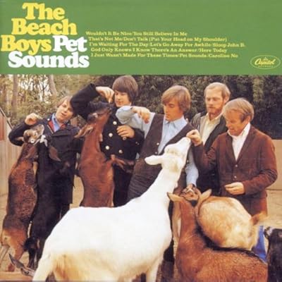
The Guardian has a delightful excerpt of a book about typography -- Just My Type, by Simon Garfield. I don't know if it has a U.S. publisher yet, but its author has a wonderful way of describing the feeling of a font.
[Cooper Black's] success soon allayed Cooper's fear that he would only achieve "a tiresome effect from the too frequent repetition of the same quirk and curve". In fact he achieved something spectacular – a serif face that looked like a sans serif. Cooper Black is the sort of font the oils in a lava lamp would form if smashed to the floor. Its creator believed it ideal "for far-sighted printers with near-sighted customers". There are little nicks at the tops and bases of letters, and they give the font a solid flat weight on a page; without them, the type would always have been appearing to roll away. For a font with such a thickset look, it retains a remarkably unthreatening demeanour.
He launches from here into a luscious description of the typeface's appearance on the album cover of Pet Sounds.
I'm sort of a type nerd, and if you're at all like me, it's a fun read. From the end:
Most type designers are understandably proud of their work. But [Thomas] Cobden-Sanderson, the maker of the beautiful Doves type, was so taken by it, and so keen that his former business partner shouldn't use it after his death, that he resolved to drown every letter in the Thames. In 1916 he began loading up his bicycle under cover of darkness and throwing his font under Hammersmith bridge. He made more than 100 separate trips, a large undertaking for a man of 76. And much of it still remains in its watery grave, forming itself into such words as the tide dictates.
Sounds like a description of a blog...
(via Better Posters)
